Premier Detasseling is a competitive, fast-paced, and selective detasseling company located in Nebraska.
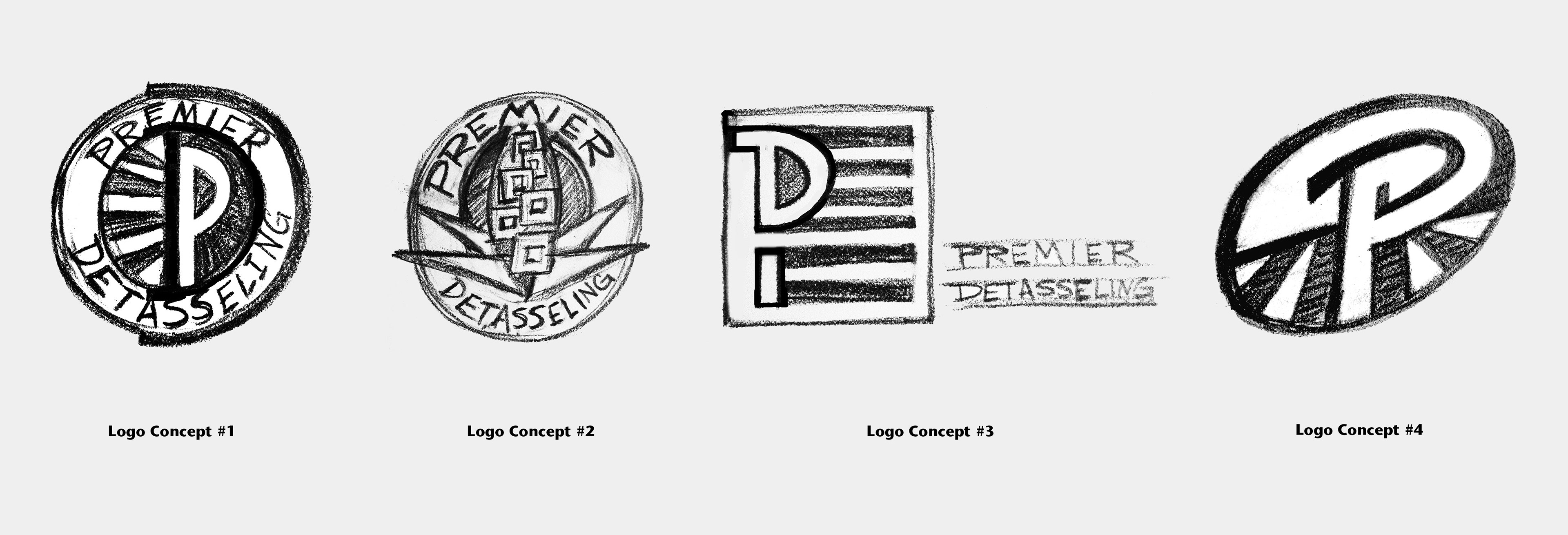
Logo Concept 1
This idea comes from exploring the relationship between the letters P and D which is contained within the circle. Beside the letters, rows of corn are represented, drawn in the perspective of looking down a field. These also point attention to the letters. I would use emerald green for the corn rows. Surrounding the graphic is the company name. I imagine this written in bold letters on top of a natural colored background. Then surrounding that, I will use a thick dark brown/black outline with the shape around the right side repeating the P and D shape again.
Logo Concept 2
This idea plays off of the idea of a premier company and is made to look like an automobile hood ornament which suggests hardworking, agile, fast and safe. The corn plant is drawn with geometric shapes on top of a dark background. I imagine the plant rendered in golden yellows and bright greens. The words, written in a bold font, will be reversed out on a darker green or blue and surrounded by a thick black/brown outline.
Logo Concept 3
This idea suggests that Premier Detasseling is an all-American company, hard-working and efficient. The stripes also refer to rows of corn which I would render in green. It combines the letter P and D into one shape. I would either reverse out Premier Detasseling in the bottom two stripes or write them to the side or below the graphic in all capital letters.
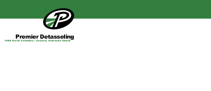
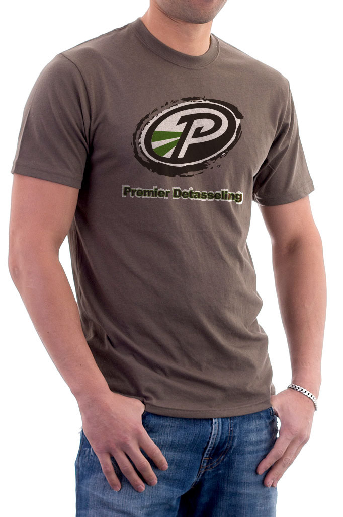
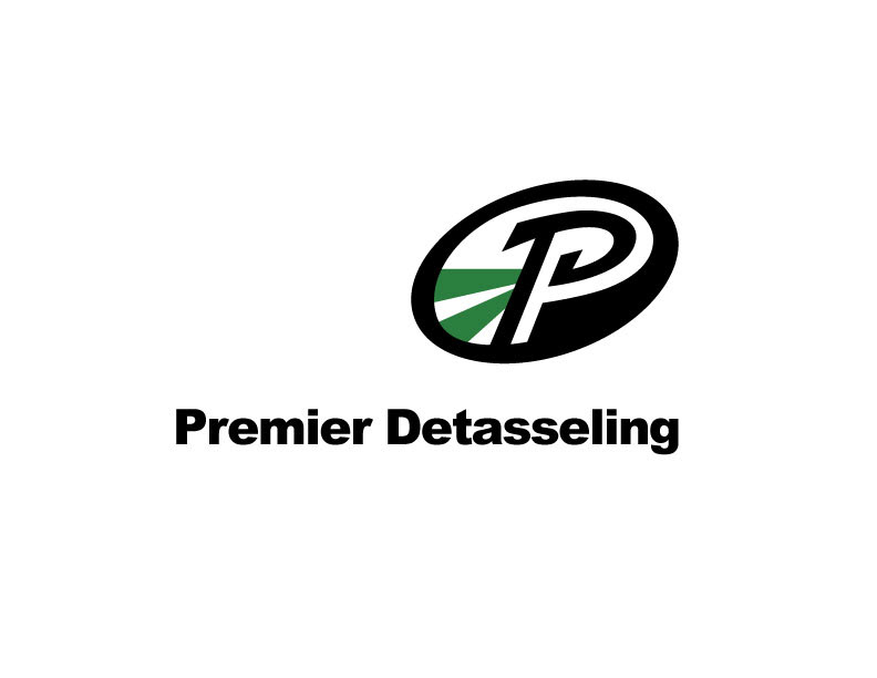
Logo Concept 4
This idea plays off of the sports branding look that the client and I talked about. The angle and shape of the ellipse suggests action. Here the P is predominant with the D subtly implied. Rows of corn direct the eye towards the letterform. The Premier Detasseling text would be written in a bold font underneath the mark.