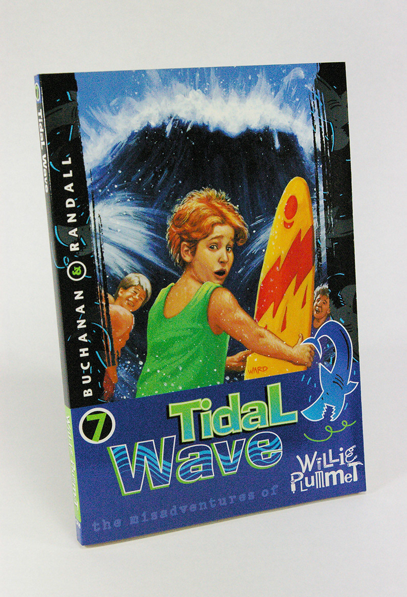
The Misadventures of Willie Plummet
Concordia Publishing House
Art direction, cover and interior design for 20 juvenile fiction books. Using the clipart image from the front cover, I created engaging step-by-step animations for the readers to follow at the beginning of each chapter. These animations told a fun story within the fun story. Cover illustrations by John Ward.

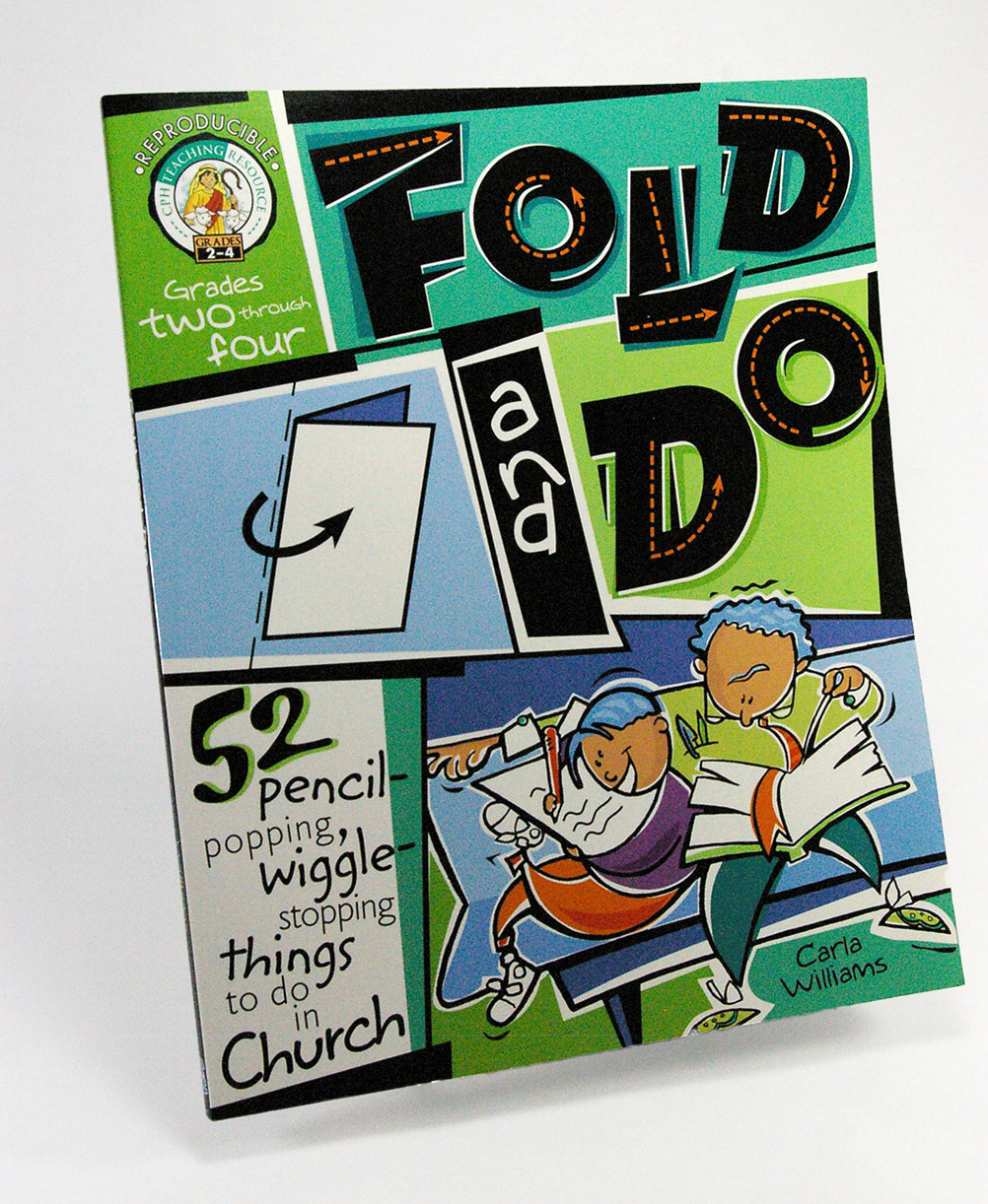
Fold and Do
Concordia Publishing House
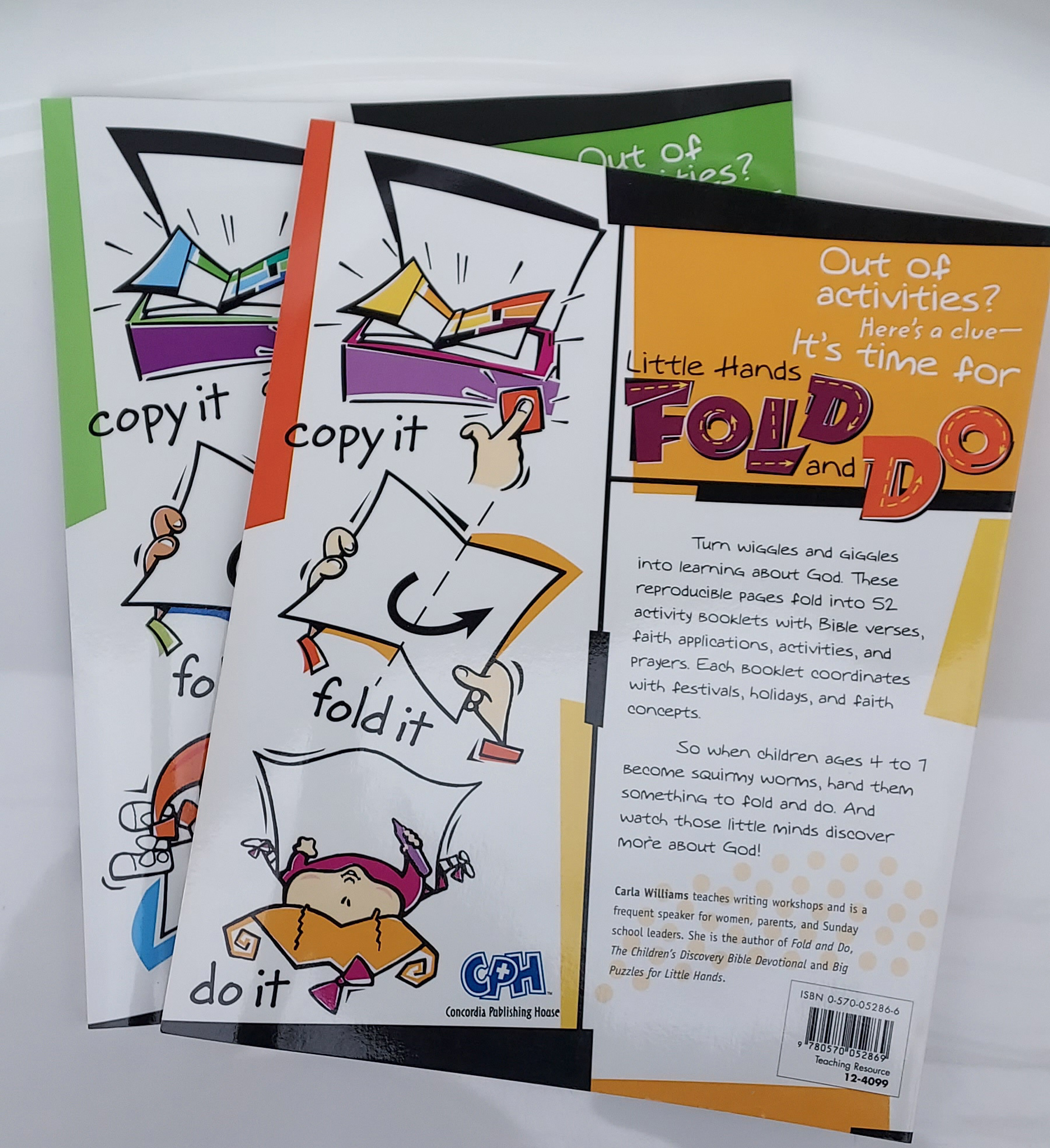
These books contain reproducible pages to make activity sheets for Pre-K through 4th grades to work on during church services. I directed the illustrator, Richard Heroldt, to draw two line art images of children sitting on church pews with their parents for the front covers and images of a photocopier machine, folding and doing the project for the back covers. I added color to the illustrations in Illustrator and positioned the graphics with the text in QuarkXPress to visually show what's inside.


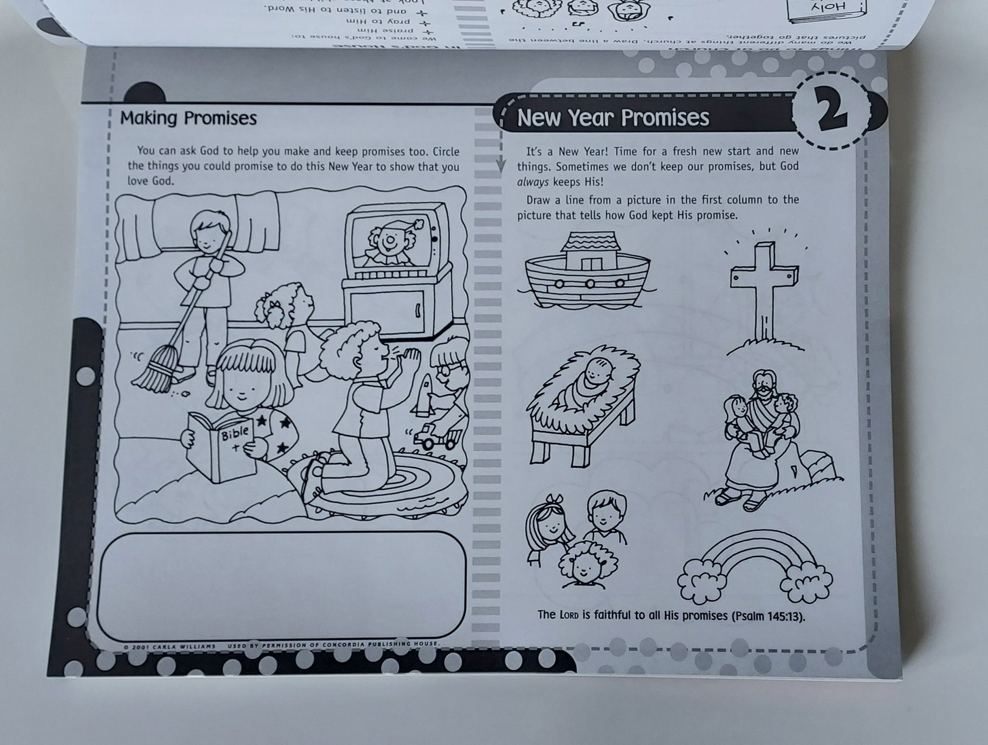
Below is the interior layout of Little Hands Fold and Do. I provided the illustrator, Becky Radke, my initial layout design and art directions for each activity page.



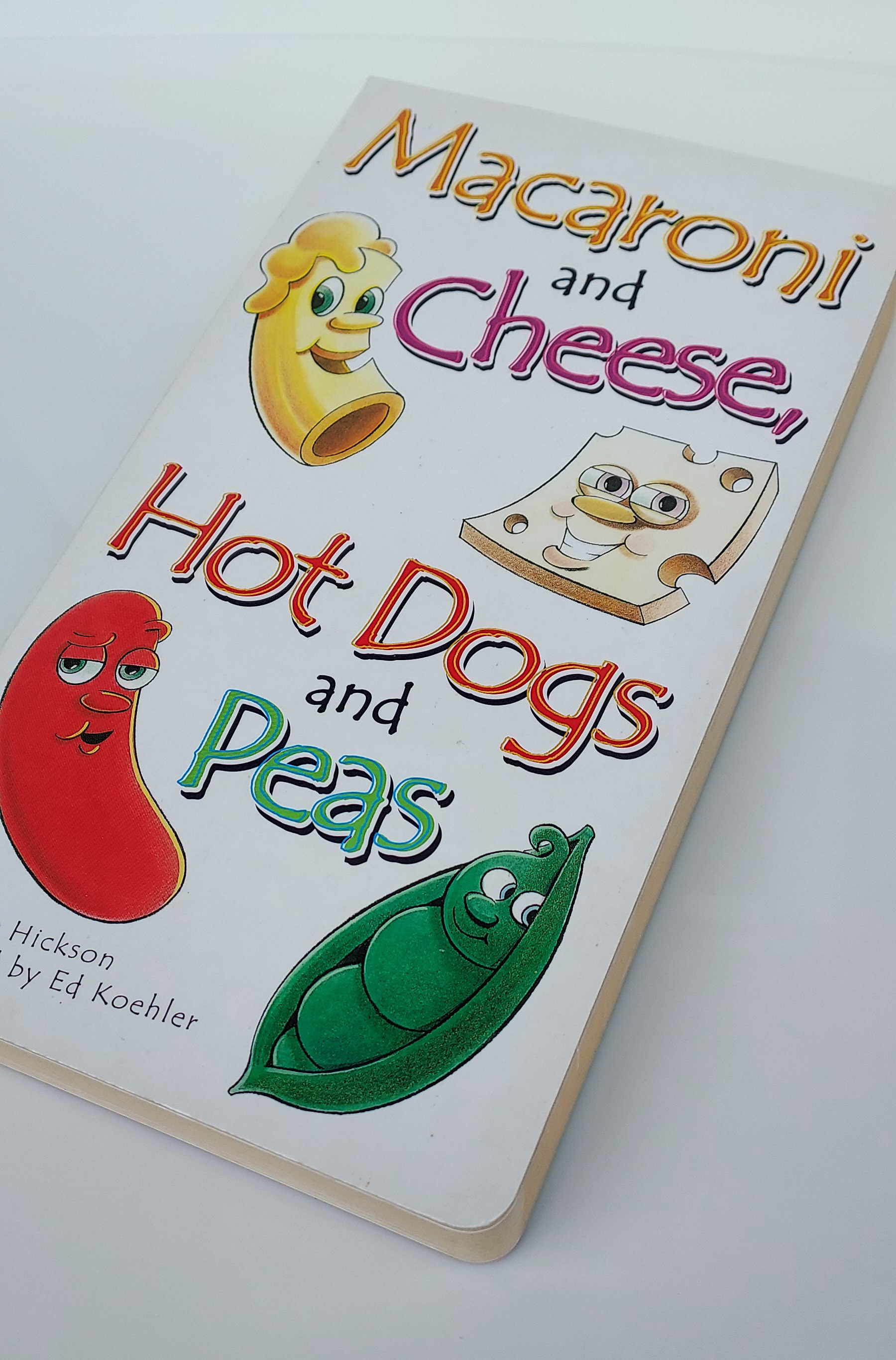
Macaroni and Cheese, Hotdogs and Peas
Concordia Publishing House
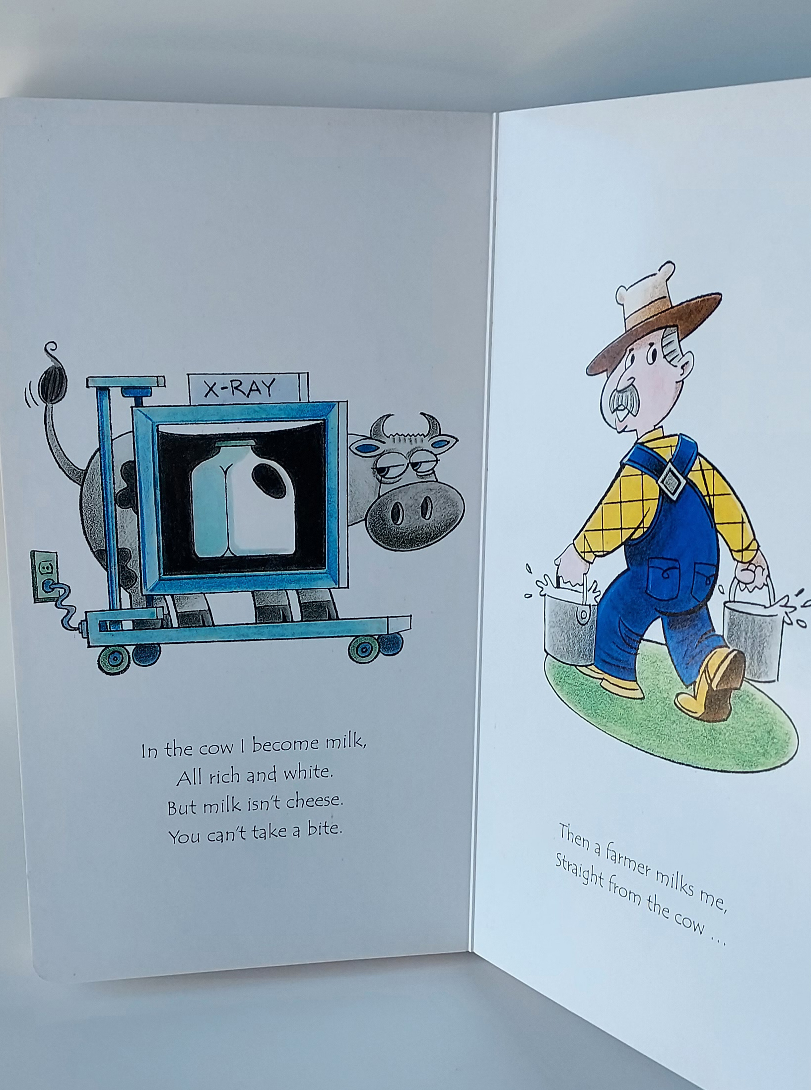
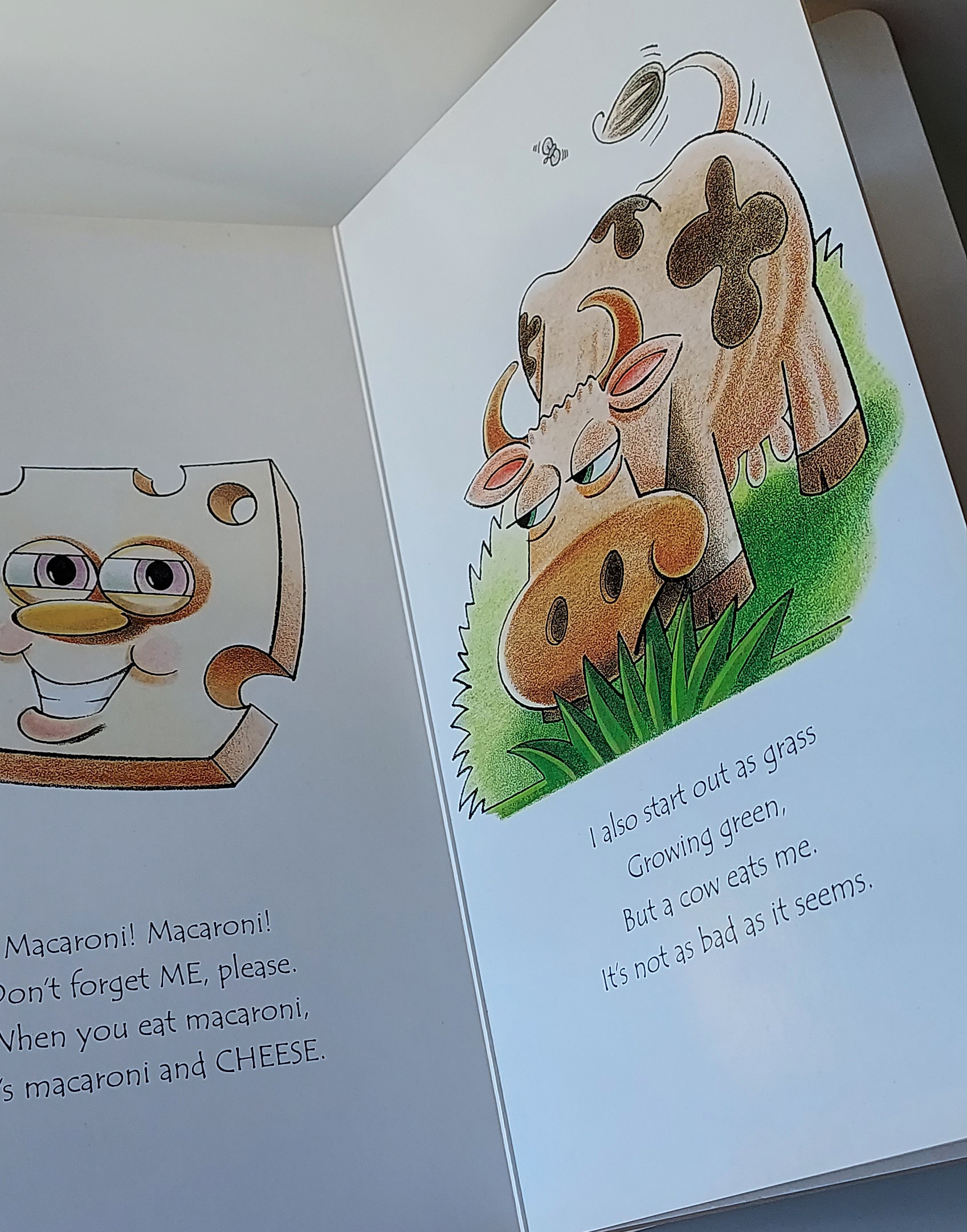
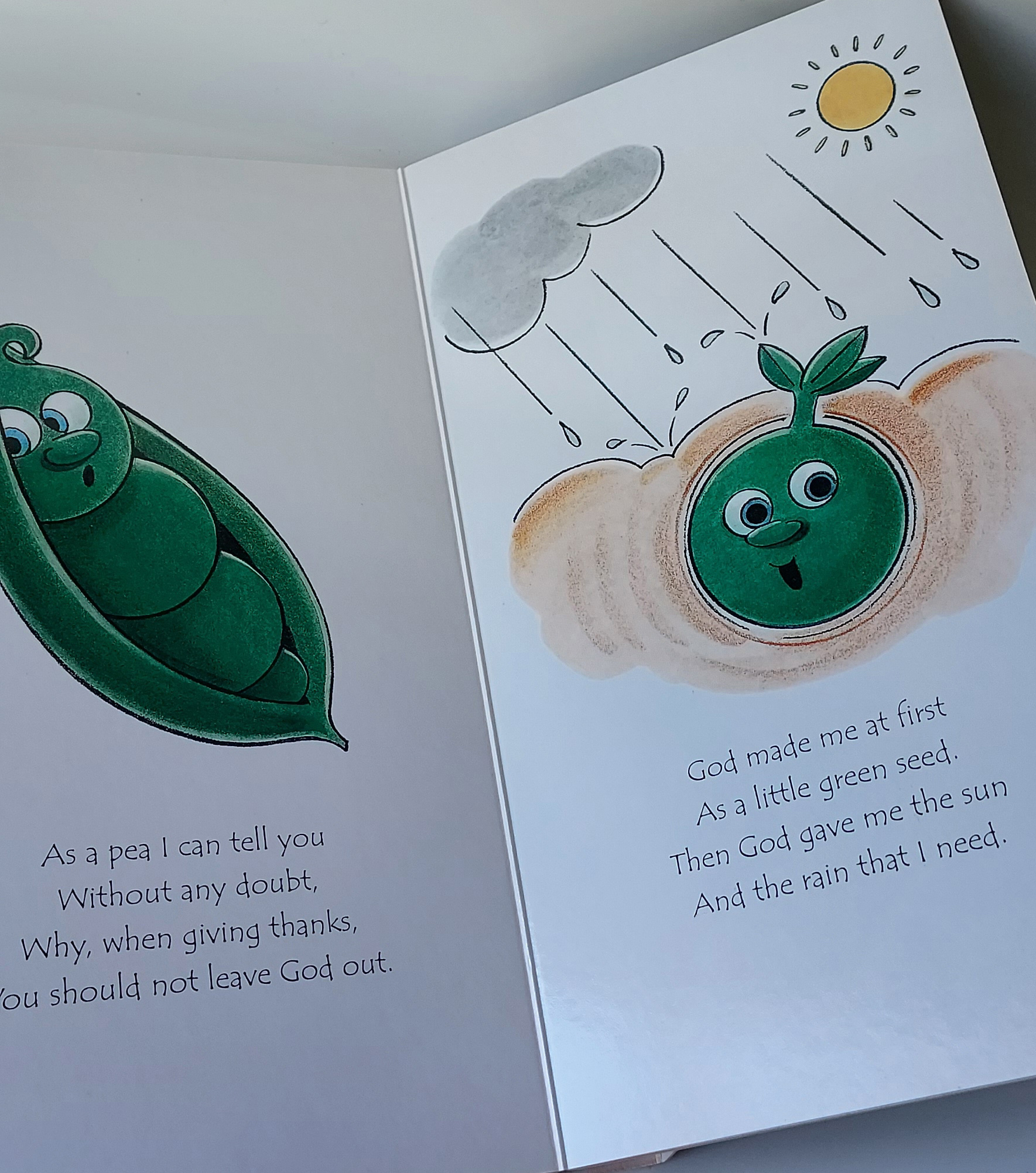
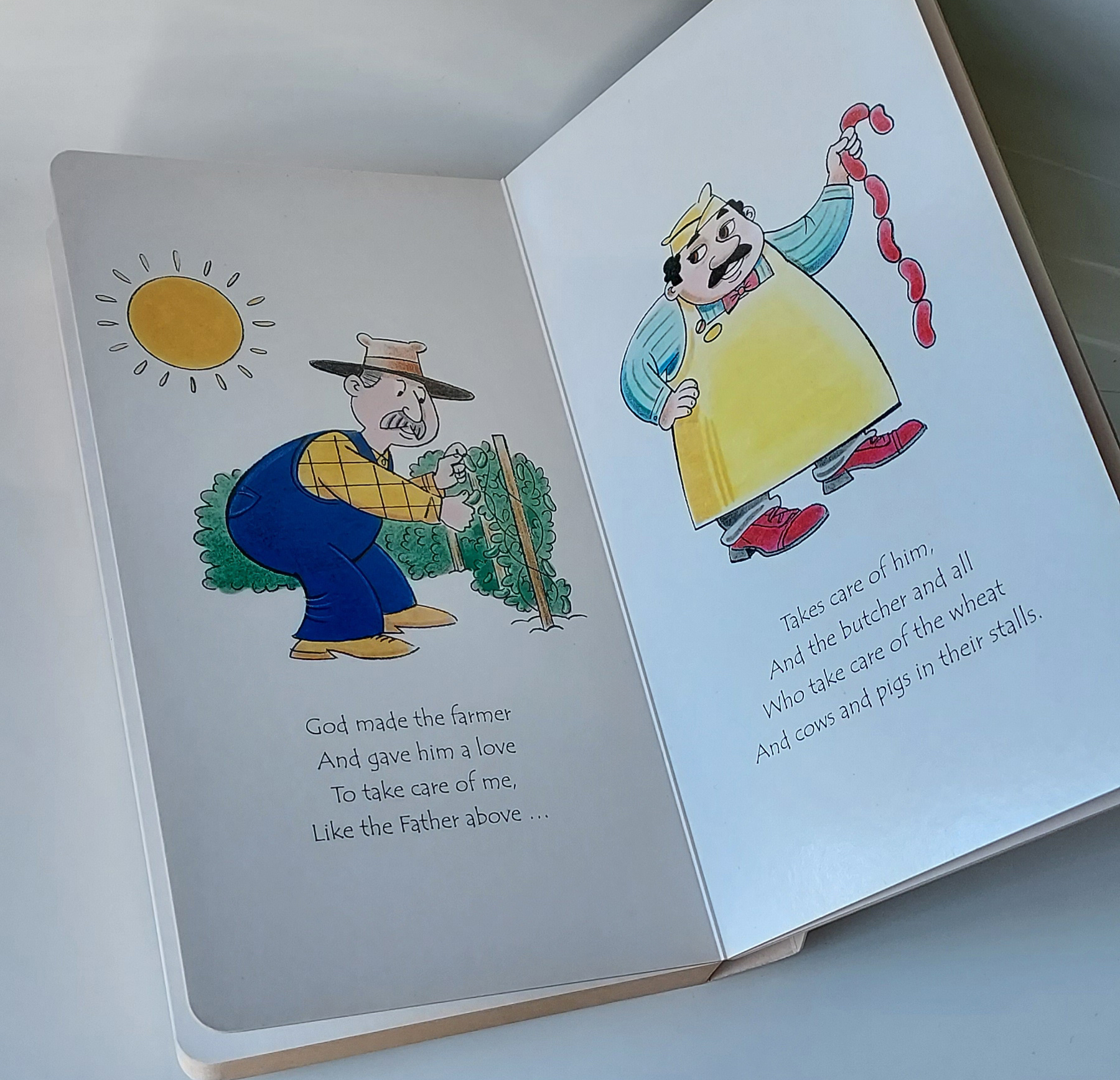
Art direction, cover and interior layout design for a delightful board book. Illustrations by Ed Koehler.


501 Practical Ways to Teach Your Children Values
Concordia Publishing House
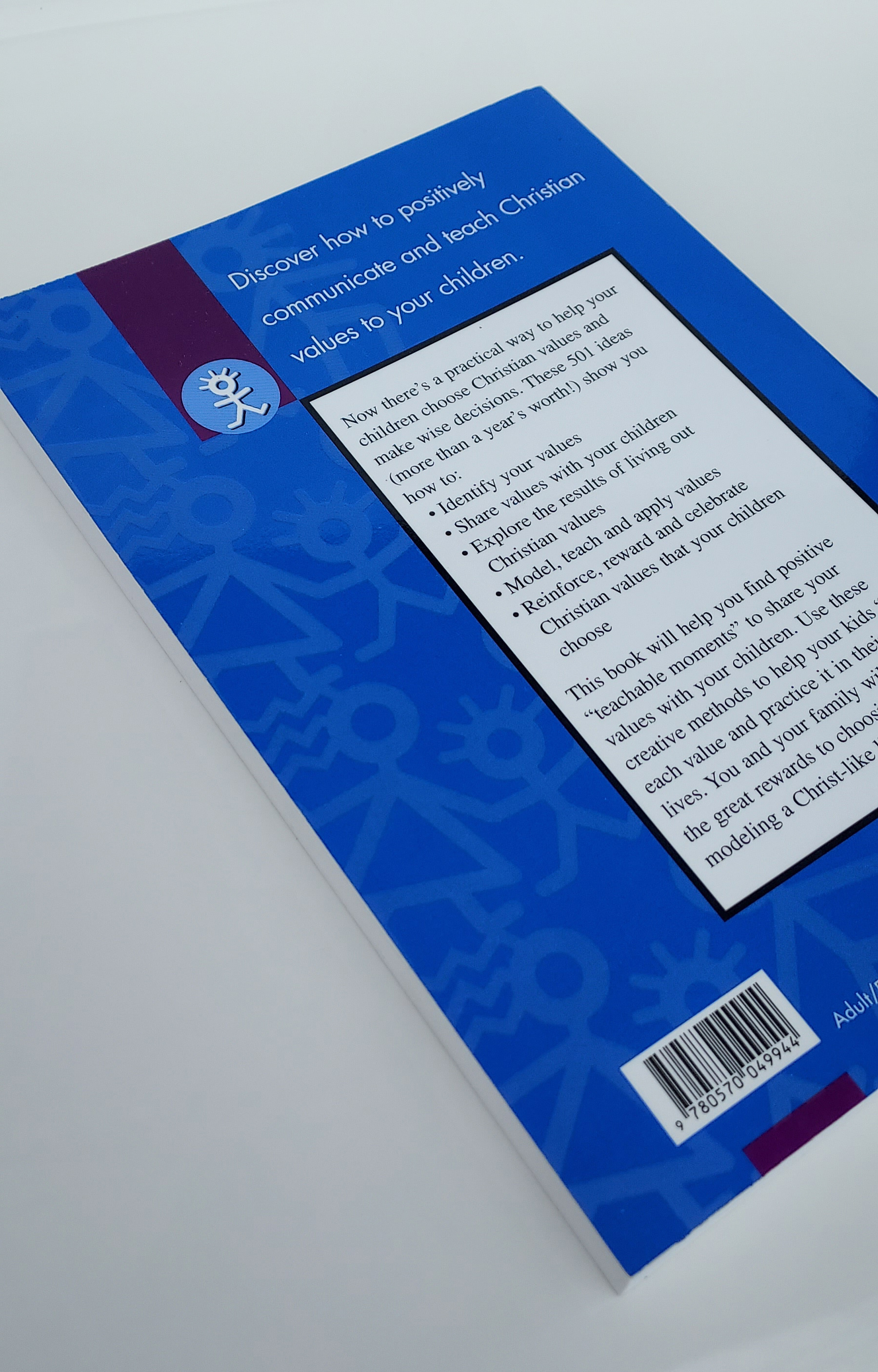
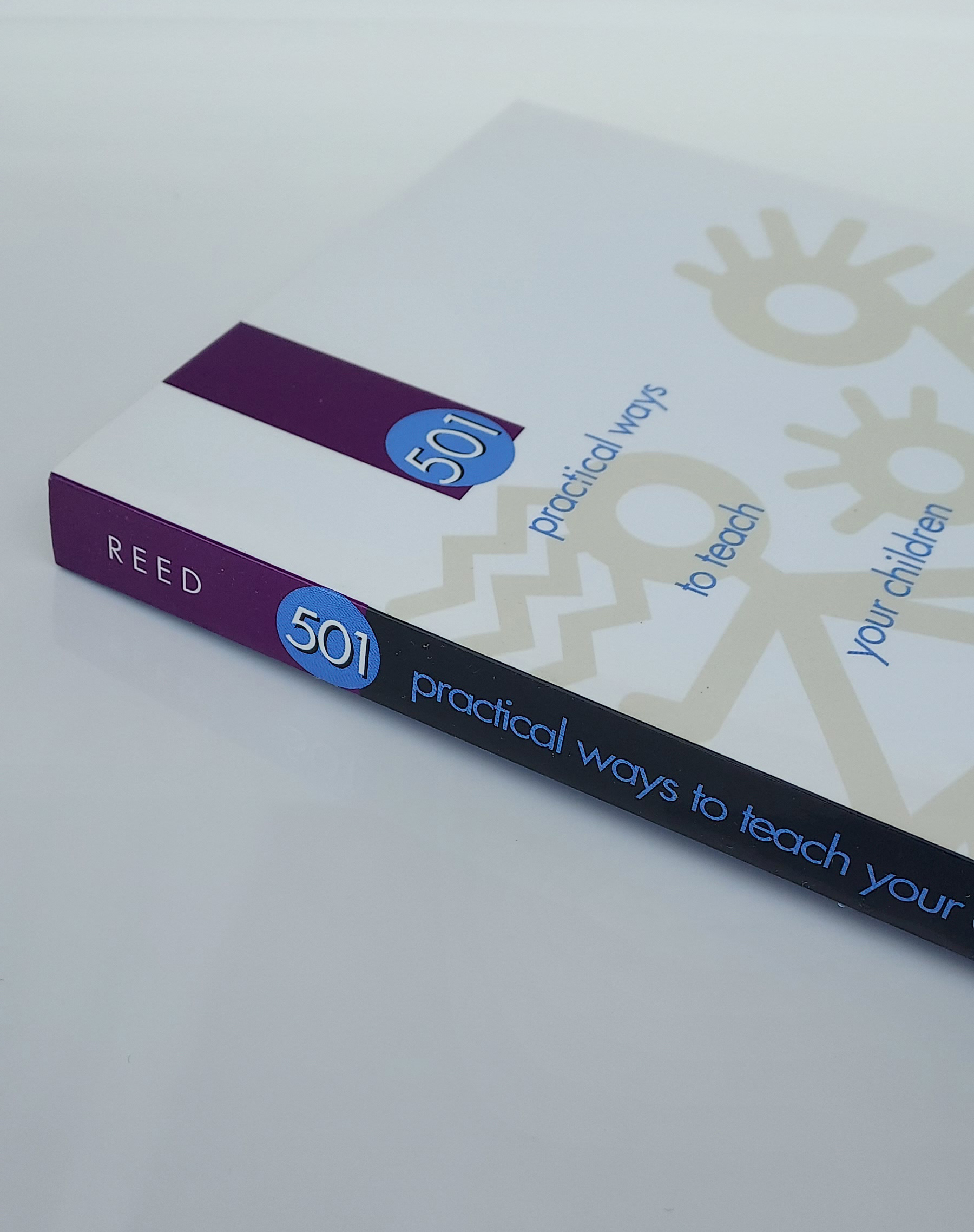
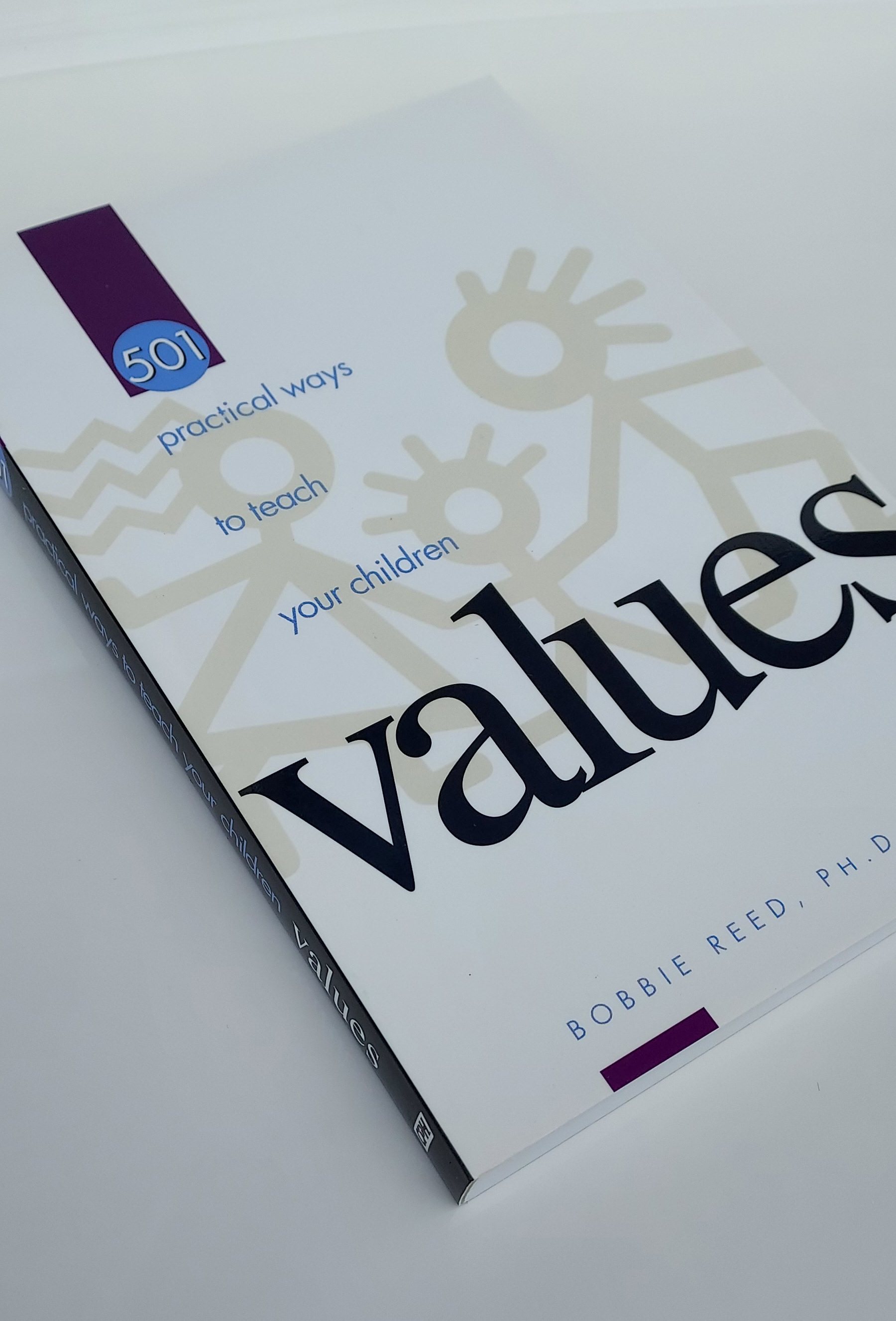
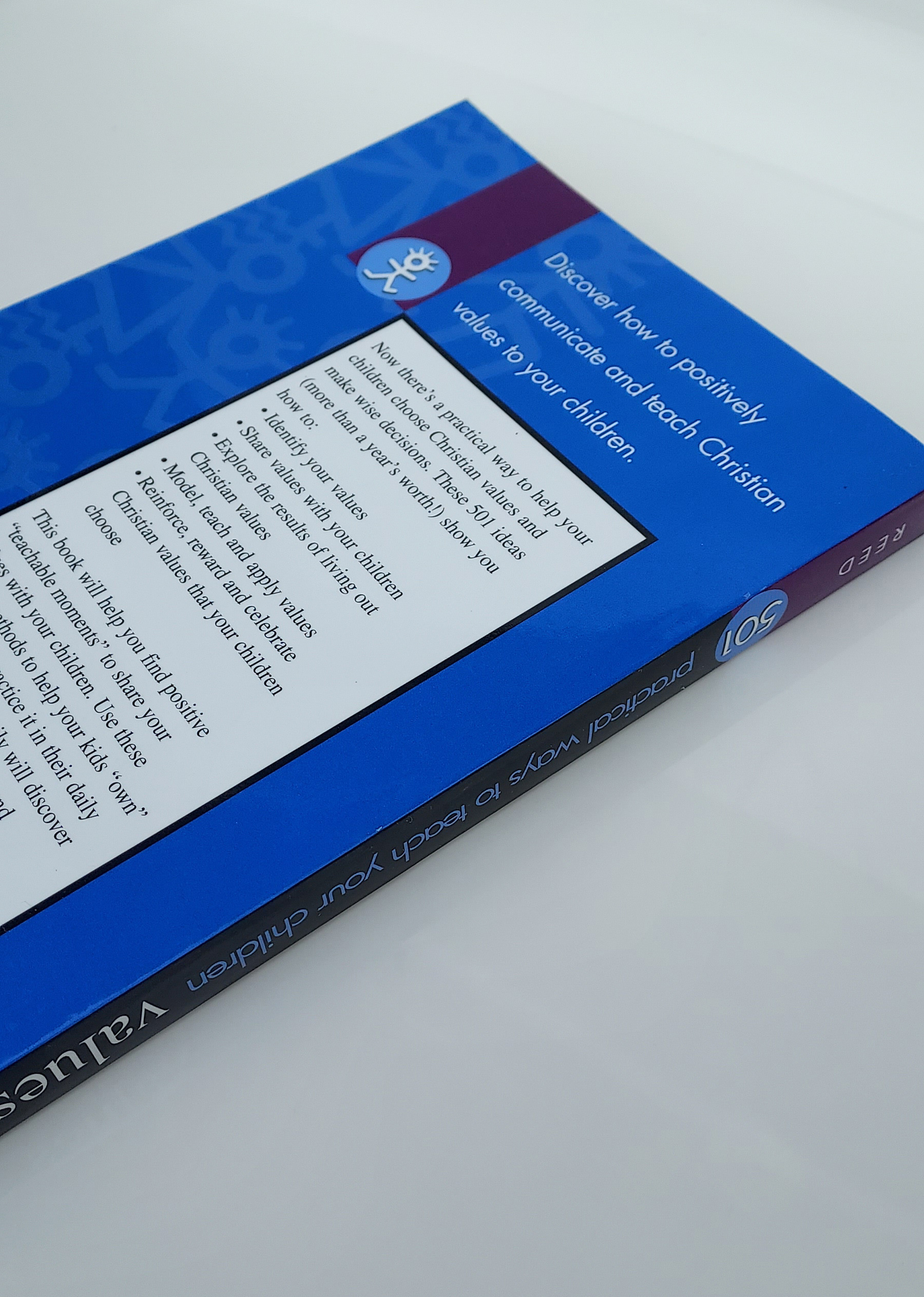
This book is a tool for parents to communicate and teach Christian values. The 501 ideas are each written concisely in one paragraph. The cover design suggests this book is simple to read with bite size bits of practical information for raising children. The high gloss cover uses a spot matte varnish on the figures on both the front and back covers.

Catching Ricebirds
Hendrickson Publishers
The message contained in this powerful autobiography required a sensitive touch. This cover design evolved from the initial idea of showing a split-screen image of the author containing AK-47s and the destruction of war contrasted with the journey of peace and reconciliation that he has experienced through forgiveness and God’s redemptive power. The end result refines this transformation by showing the emergence of the author from a dark-filled space to light with a resolute expression on his face. I directed the photographer towards the lighting of the shoot and to position the camera below the author’s chin to contribute to the suggestion of his strength through Christ. Cover photo by Shannon Lankford.

We Choose Life
Hendrickson Publishers
Instead of focusing on the terrible tragedy of abortion, the cover of We Choose Life reaches out to the target audience by featuring the positive result of choosing life. Bright colors, the movement and expression of the young boy, and the Gioviale typeface support this directive. Point-of-view perspective is used to engage the reader, drawing them into these authentic stories. Cover photo iStock.com/Andrey Artykov.
Running the Race of Faith
Concordia Publishing House
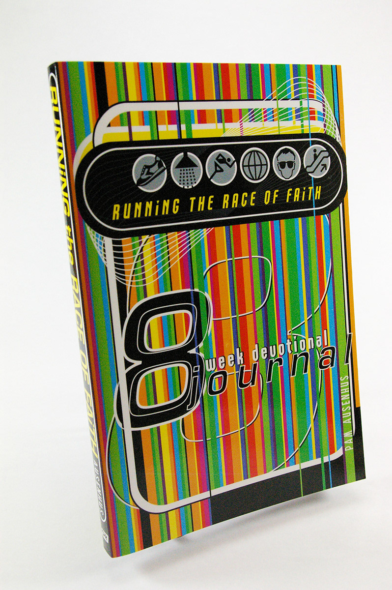
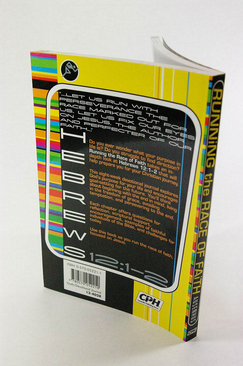
For this teenage devotional journal I chose bright, contemporary, racing stripes and colors. After laying down the stripes, I added track boundaries to highlight the main title and enlarged figure eights to add to the cover motion. I picked out icons from stock images. The icons indicate—in a non-traditional way—the life marathon that the teens are running.
150 Psalms for Teens
Concordia Publishing House
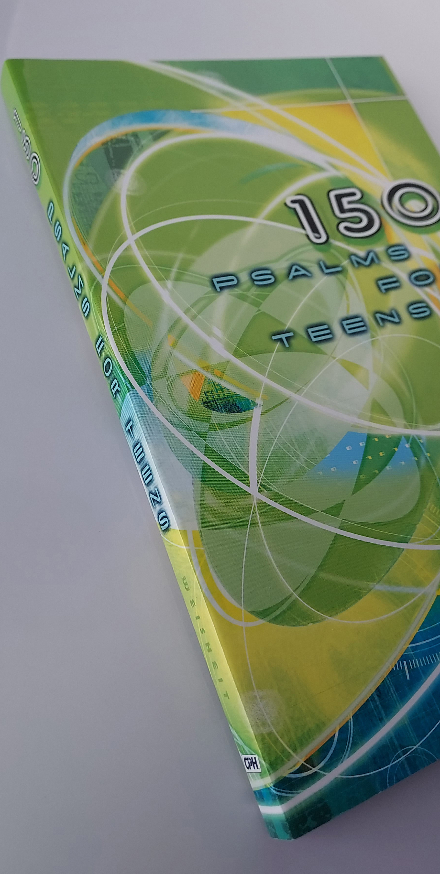
This book contains a paraphrase of all 150 psalms in a style and tone teens will resonate with. I collaged all the lines and textures in Photoshop. The movement of the cover image suggests the emotional roller coaster that teens can experience in their daily lives. In the midst of all that is the consistency of God's love indicated by the two straight lines running through the design.

God Words
Concordia Publishing House
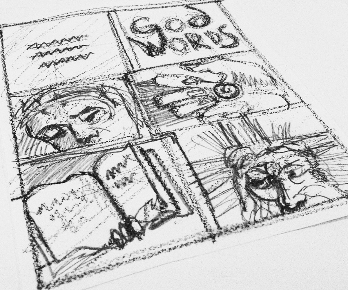
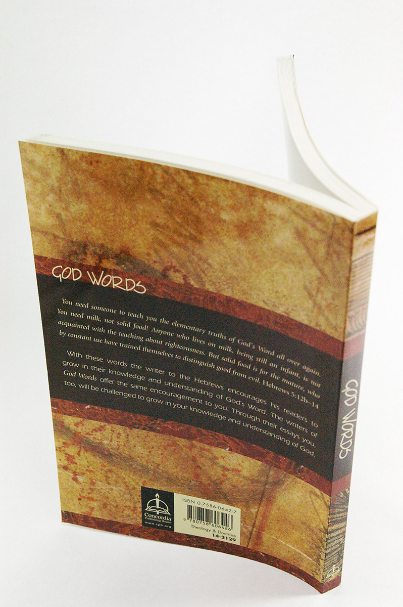
This book is a collection of essays that share the elementary truths of God's Word. The text encourages the reader to build upon their knowledge and understanding of God. I looked for classic Christian woodcut imagery that when stacked as building blocks represented these truths.


Front-Page Preaching
Concordia Publishing House
The sermons in this book address 12 contemporary issues that play a significant role in reflecting and shaping core values of society. The words "Front-Page" were typed on my old typewriter and enlarged with the office photocopier to emphasize the ragged edges and harken back to a time when reporters utilized typewriters to deliver the news. I then collaged pieces of both good and bad headlines from the current events at that time into the design.
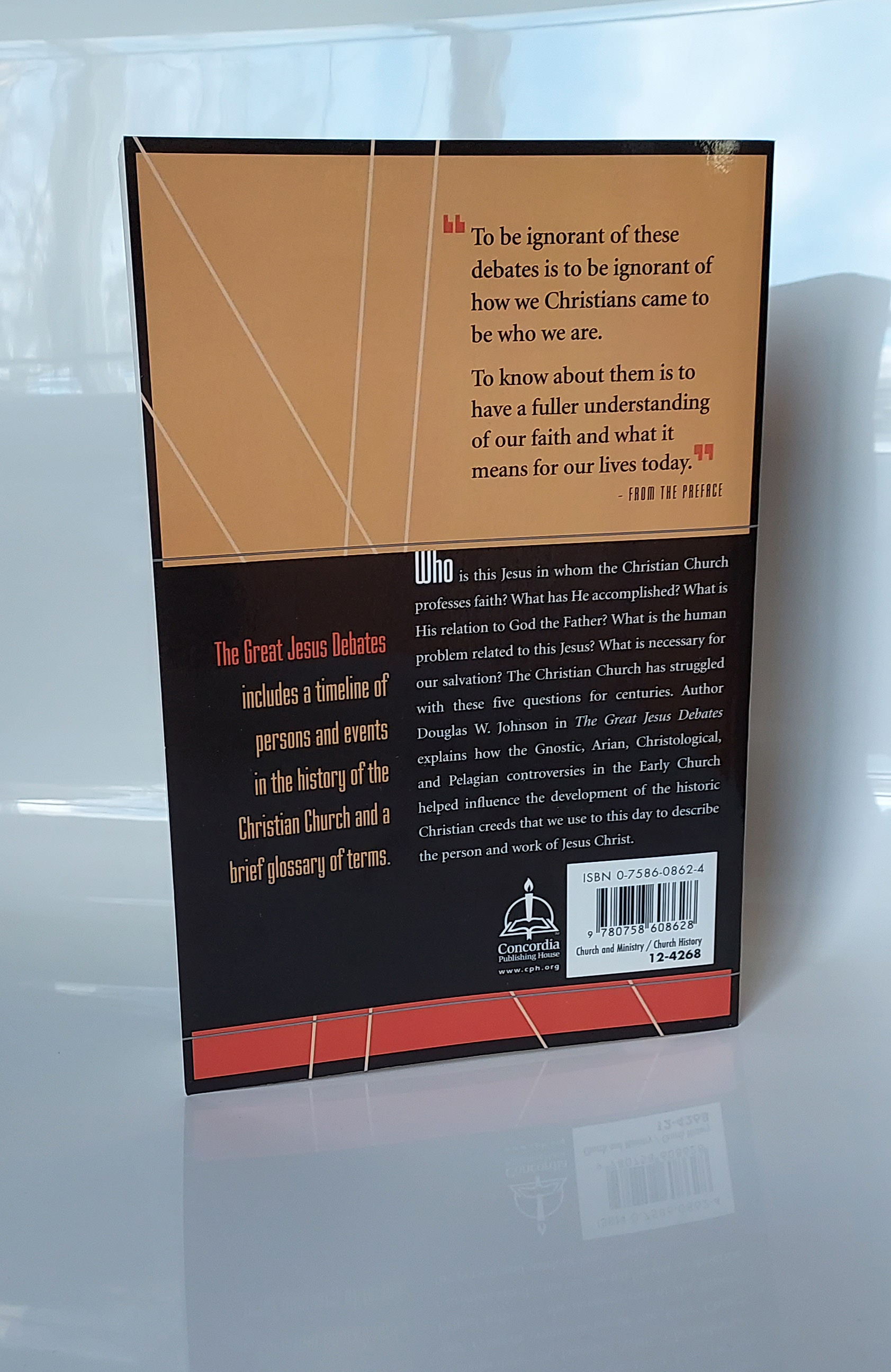
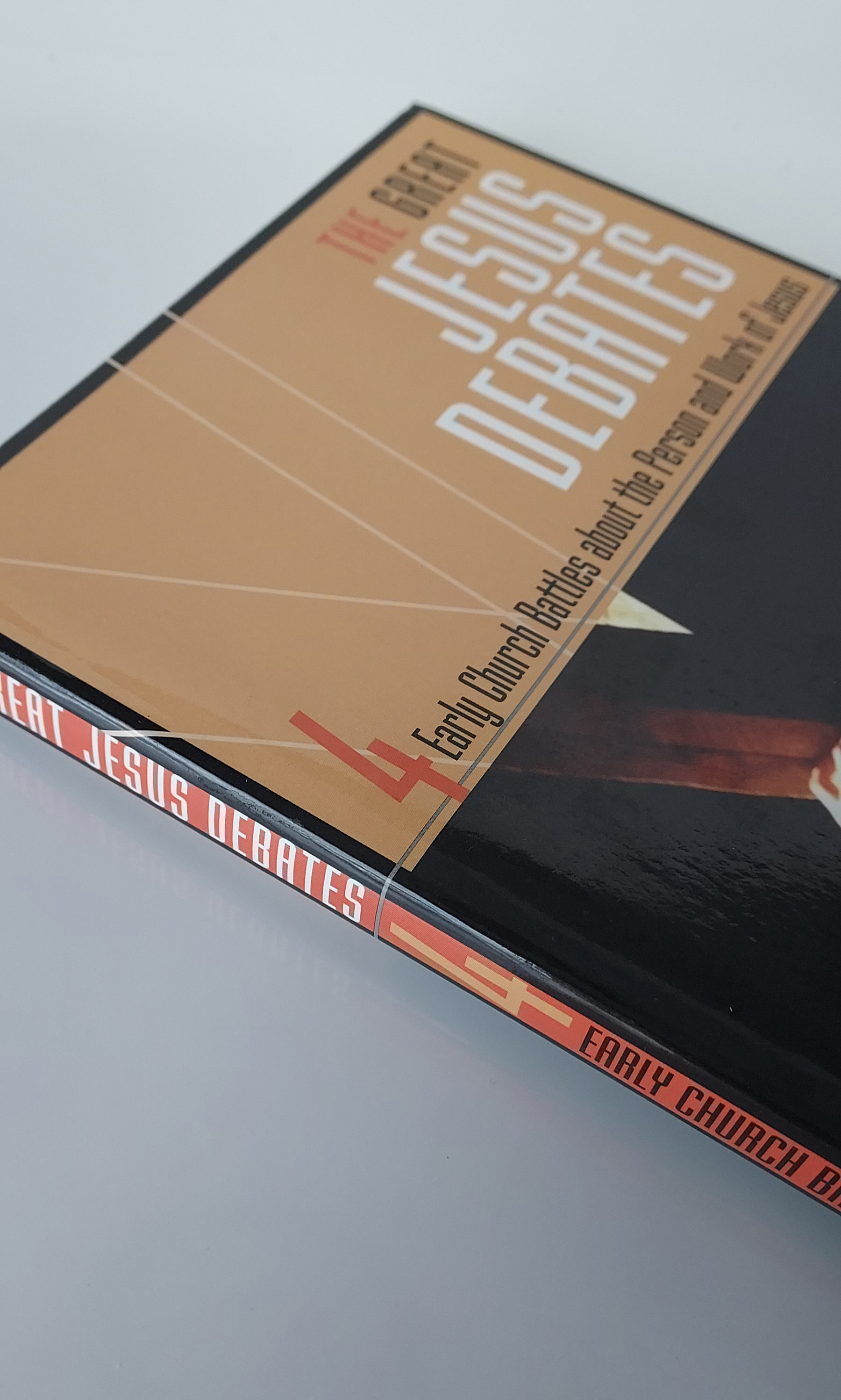
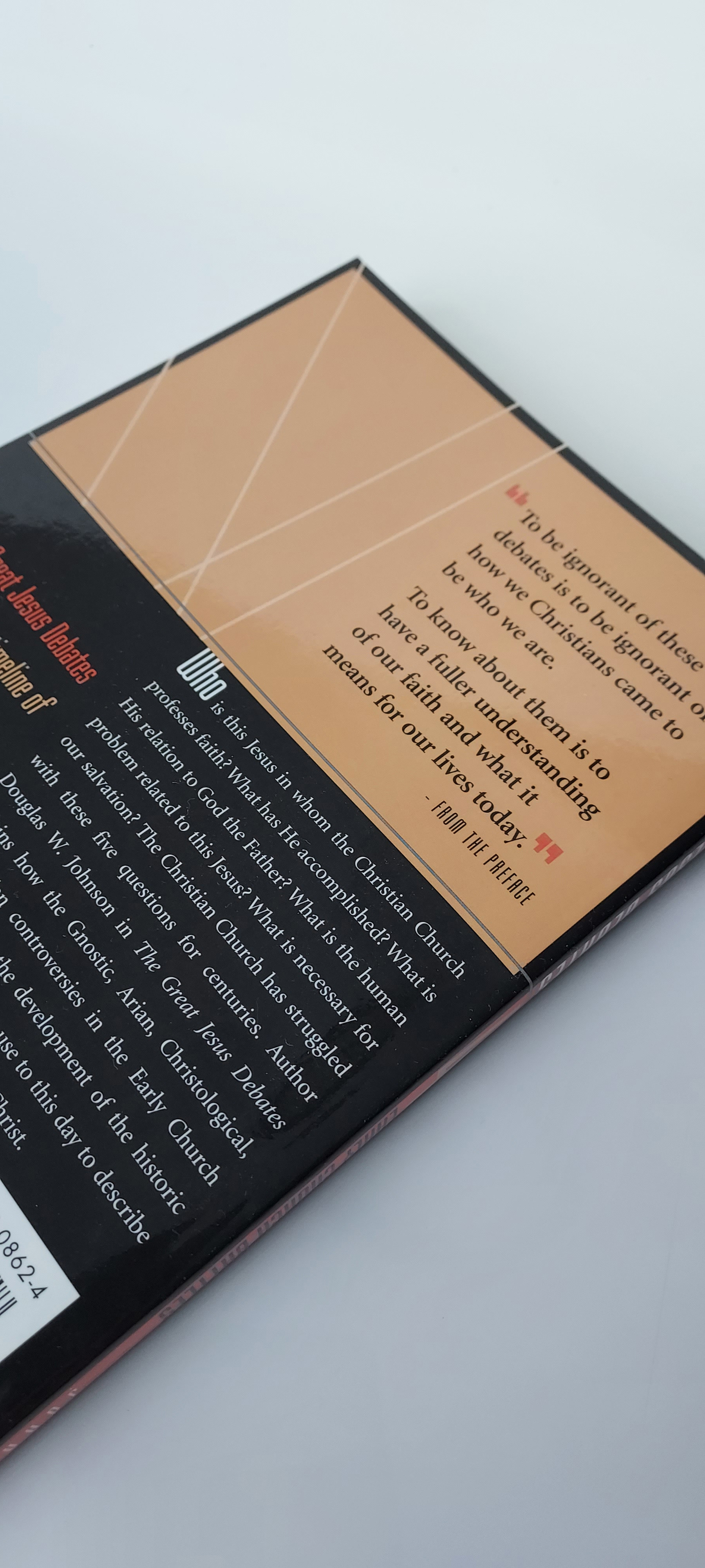
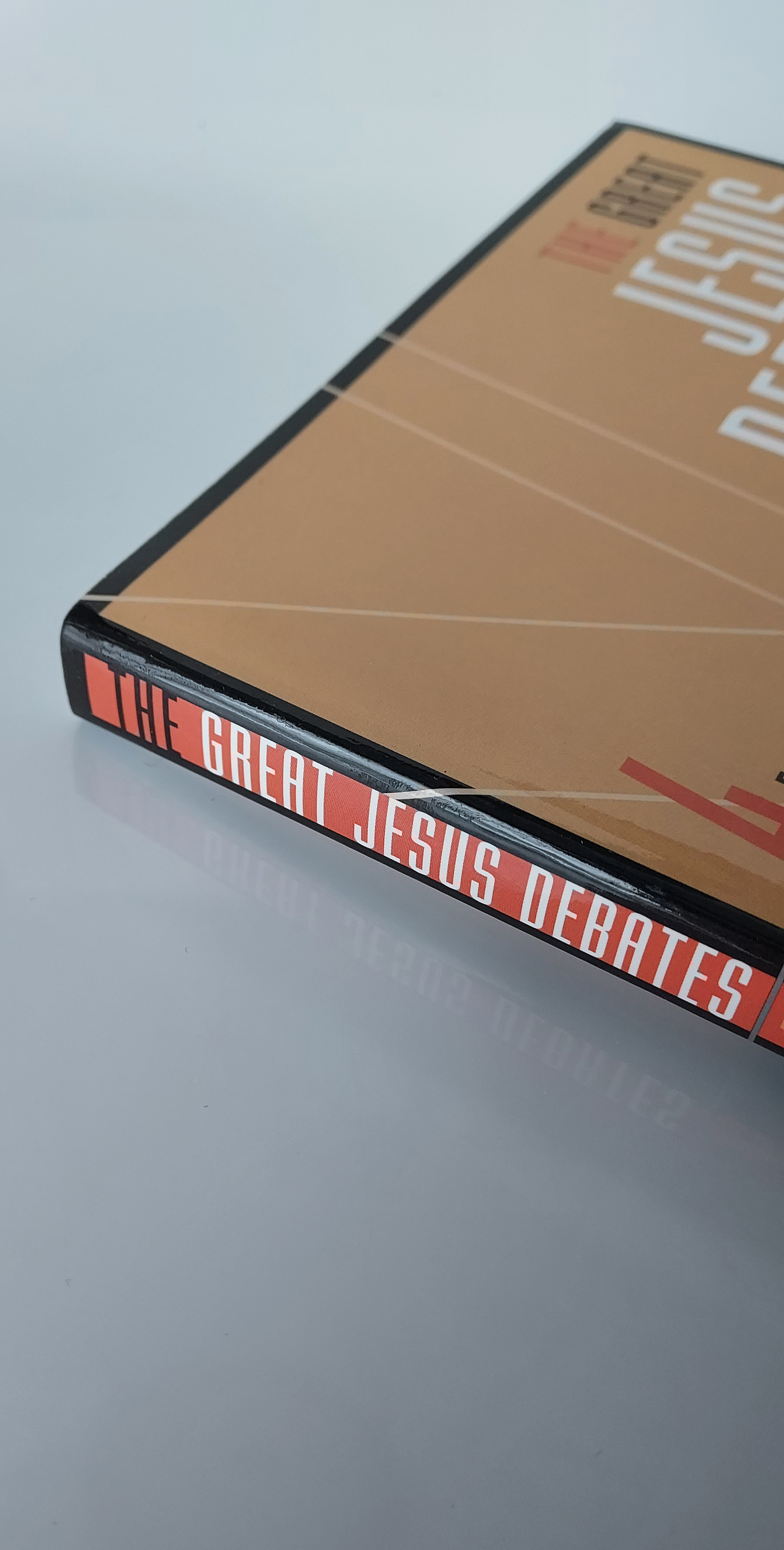
The Great Jesus Debates
Concordia Publishing House
Cover and interior design. This book explains how controversies in the Early Church helped influence the development of the historic Christian creeds that we use to this day to describe the person and work of Jesus Christ. Cover photo by Design Pics Inc. / Alamy.

